|
||||||||||||||
|
||||||||
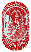
| Wes
Wilson was the true pioneer of the psychedelic poster as we recognize it
today. Wilson designed many of the early posters for the Family Dog collective
and for Bill Graham's Fillmore Auditorium shows. He took all the space available
on the poster and filled it with wild curving letterforms, usually inking
the space between the letters so that the words were actually formed by
the "negative space." The eccentric lettering curved around whatever
image Wilson chose for the poster, but in some cases, the lettering became
an image itself! Wilson's psychedelic poster designs attracted attention
and let the young people of the counterculture know that something new was
happening in San Francisco. Although it was often difficult to read the
exact information Wilson was commissioned by the promoters to convey with
the poster advertisement.
Wes Wilson was a young person who loved to draw, but his career as a poster designer had an unlikely start. After attending junior college in Auburn, California he transferred to San Francisco State, where he studied philosophy. As the beatnik era was evolving into the hippie scene, Wilson was working for San Francisco printer Robert Carr who produced handbills and programs for the San Francisco art scene. Wilson did paste-up and layout work for Carr and began designing handbills for some of the early rock shows. In January of 1966, he designed the advertising flyer for the "Trips" festival held at Longshoreman's Hall, a seminal event in the development of the psychedelic scene. Wilson's experience with the sights, sounds, and the LSD that was distributed at these early events was a major influence on his designs. As San Francisco promoters Bill Graham and Chet Helms of the Family Dog began promoting weekly concerts at the Avalon Ballroom and Fillmore Auditorium, Wilson decided to produce posters to help promote the concerts, thus evolving into a poster designer. Although his use of highly modified letterforms seems to have begun its evolution organically, Wilson sites a 1965 exhibition of German Expressionism and Jugenstil at the University of California as an influence on his work. Like the work of the Viennese graphic artist German Alfred Roller, Wilson's exaggerated letterforms and patterns influenced the work of the artists around him. Soon, other artists adopted hand lettered psychedelic typefaces and the jolting colors that Wilson pioneered and the San Francisco poster movement was in full swing. Although he designed eleven of the first twelve posters for Chet Helms and the Family Dog, Wilson began doing posters exclusively for Bill Graham, who allowed him greater creative latitude. However, there were always quarrels between the two, as artistic form usually overwhelmed the advertising function. Wilson was an artist who enjoyed drawing, used the human head as a motif, and his voluptuous wife as the model for a number of his most memorable posters. In these designs, he used the head or body as the form and filled it up with letters that were nearly impossible to read. Wilson designed the Fillmore posters through May of 1967, when he stopped designing, feeling that the financial remuneration for his poster designs was not commensurate to his effort or the effect that posters had. After
his great pioneering work of 1966 and 1967, Wes Wilson gradually drifted
into other design work and the fine arts. In the 1970's he moved his family
to a quiet farm in the Missouri Ozarks. In 1990, Wilson was the subject
of a retrospective at the Springfield Art Museum titled "Looking
Back: Rock Posters of the the 1960's by Wes Wilson." For a few years
he published "Off the Wall" a popular art journal devoted to
the poster image and produced several poster expositions. |
||||||||
| Jeffrey Morseburg | ||||||||
| Copyright
2003 Jeffrey Morseburg Not to be reproduced without the author's specific permission. |
||||||||